Hells Kitchen
Case Study
Gordon Ramsay's latest restaurant, Hell’s Kitchen. Inspired by the hit show of the same name, designed to be an experiential and immersive destination. Interior features engage to all senses and are a nod to both the red and blue teams featured on the show. The dynamic and bustling kitchen is the centerpiece of this unique restaurant to be enjoyed and appreciated from every seat in the house.
LUXURY MEETS EXCITEMENT
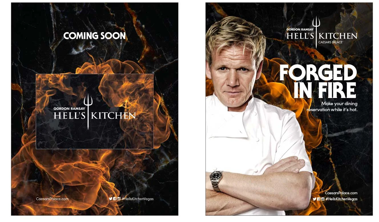
• The high-energy and fiery nature of the show translates into bursting and crackling snippets throughout the layout
• Interior design elements like marble, gold details and luxurious backgrounds echo the exclusive feel of the restaurant and that of Caesars Palace
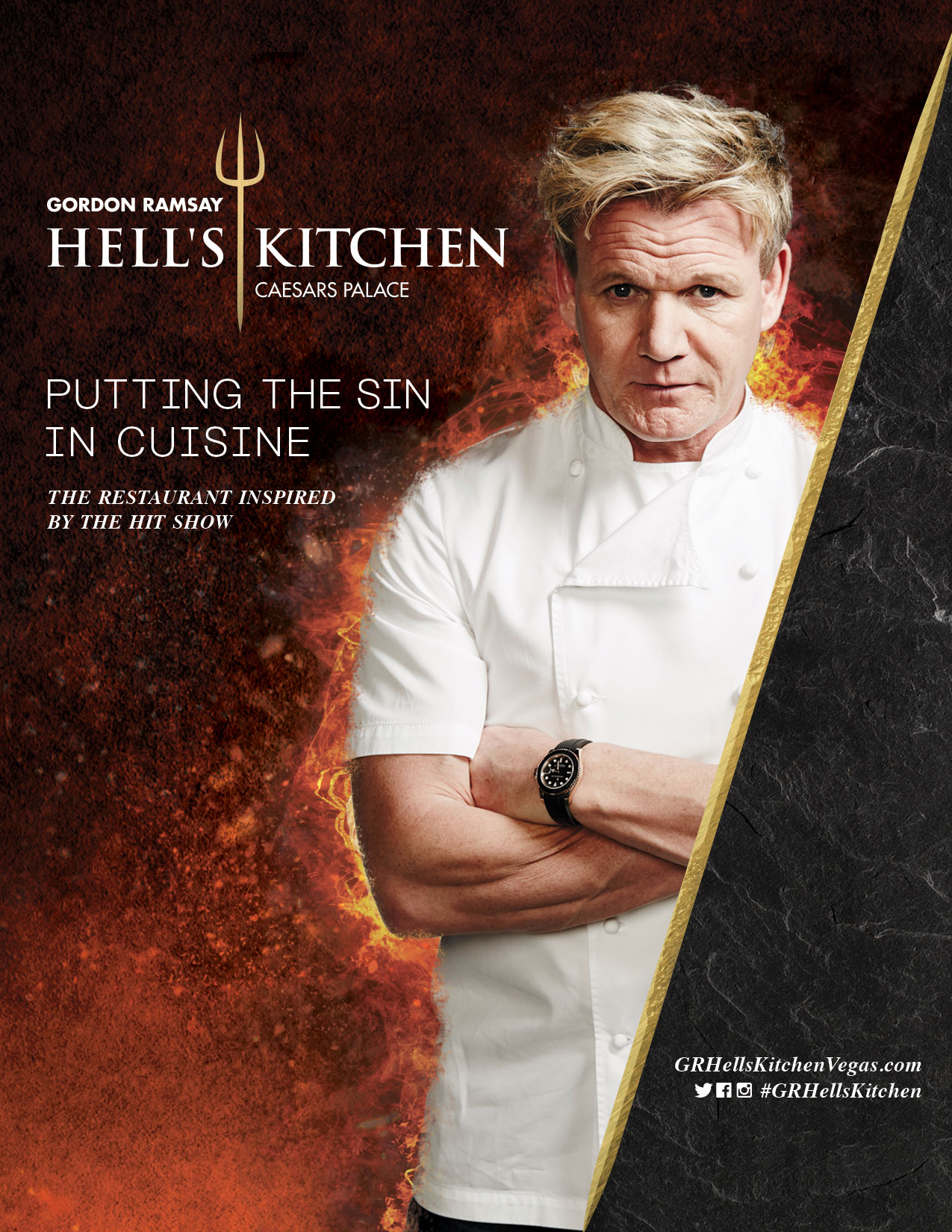
• A sharp, gold bar inspired by the iconic pitchfork creates a dynamic and interesting visual balance
BRILLIANCE SET IN STONE
• A classic building material provides weight and ingrains the new restaurant in the Caesars Empire
• Combination of dark marble and scorching flames speak to the seriousness with which Gordon approaches his craft
• A strong and bold brand presence is established through use of a full color image of Gordon, this links it to the rest of his restaurants.
THE DEVIL OF HELL’S KITCHEN
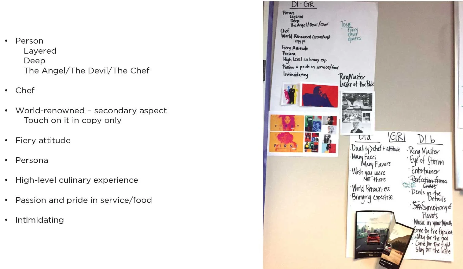
• Clever humor, a touch of attitude and Vegas flair, makes a strong connection with Gordon Ramsay and the Hell’s Kitchen brand voice
• Classy minimalistic style allows the visual elements to stand out boldly
• The monochrome and gold color palette reinforces the luxurious nature of this upcoming Caesars Palace venue
SPEAKING RAMSAY’S LANGUAGE
PERSONALITY DRIVEN
DARING USE OF COPY
FIERCE COLOR GRABS ATTENTION
Solution
A strong and bold brand presence is established through use of a full color image of Gordon Ramsay as master of his domain. Messaging strikingly uses Ramsay’s voice, capturing the fierce personality while lending his authority to the brand.
Interior design elements like marble, brushed bronze details and luxurious backgrounds echo the upscale character of the restaurant and Caesars Palace. The high-energy and fiery nature of the show translates into red and blue fire elements throughout the design. A sharp, bronze bar inspired by the iconic pitchfork creates a dynamic and interesting visual balance. It generates excitement for the restaurant, while offering sustaining messaging and design—flames and all.
Final creative HERE


